

-
Recent Posts
Archives
Blogroll + Links
This video was at the top of my vimeo feed last night so i watched it and i really like the look of it, but i posting it for a little part in particular and that around 1:40 where (i assume) her grandad is walking on the beach with her, its only a really quick bit but i like how only half of the man is painted and its painted each frame. i was wondering it that could work in 3D with a texture background like the Hut test and over colouring half of a character or objects UV Map if it would blend well, that might be my next test.
Posted in Uncategorized
I decided to do a more in depth test with the modeling and actually texture the model as well so i decided on modeling my floating blob/ghoul character that i made into a gif a little while ago, i decided on using that 1. because i like the character and 2. because it isn’t a hugely intensive model and texturing project, just fairly quick to do with nothing to complex. i originally modeled it without the arms because i just wanted to make it a quick test.

Again i used the original drawing as a reference to keep the look and quality of the drawing. Overall i think it really worked well, i could of unwrapped all the sections and added the little details as well on the bones but i thought i didnt want to waste loads of time unwrapping each bone just for the little details when what i got anyway was working. Because i felt it worked so well i decided to finish him by adding the arms.

The finished thing turned out pretty close to the original drawing, a few issues that i’ve noticed when i’ve been using original drawings that weren’t necessarily meant to be used as reference is that i have to take as much from them as possible but still producing something that will actually work in 3D in this example, it is the little bones at the bottom, which i could of added but i felt they wouldnt look right in 3D because the spine is quite thin and fairly central to the body(or at least was when i came to this conclusion) that the little bones around the bottom wouldnt look right just floating at the bottom of the model. the second part that i felt wouldnt work right were the arms, firstly the extra little bone where the elbow would be, would of meant a lot more effort in the rigging stage to get the arms bend loosely rather than more rigid like a normal arm. Also the placement of his left arm wasn’t really possible or natural looking when i tried it, so i had to position it a bit more naturally but keeping the same overall position of the hand.
Posted in Uncategorized
So taking on board the ideas i was talking about in the previous post, with concentrating more on the modelling of the objects to get them a more unsymmetrical and naive look to them like my drawings i modeled the hut for the Headless Horseman. Again like i did with the astronaut character i used one of my drawings as reference rather than making a proper design reference and modeling from that, i used my actual design drawing of the hut in Maya of just the front view and modeled it as closely to the drawing as i could obviously there are parts like the roof how it tapers in, which is more of a perspective thing rather than how it would look from a direct front view, and like the front porch bit, but easy amendments and i could still using the wonkyness of the drawn lines as references.
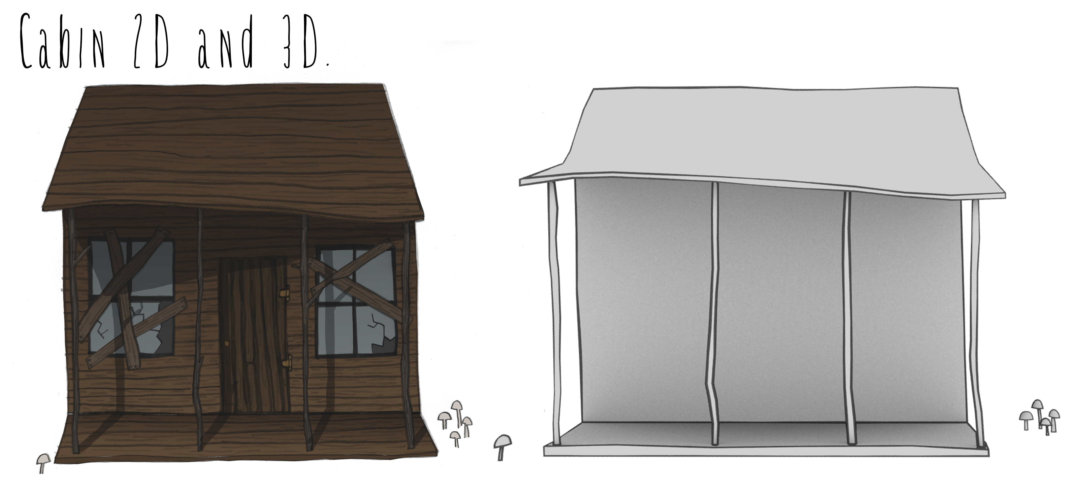
i think this test sort of shows how the modeling of the objects is far more important than the actual line work and look of the line, because this is just the generic ink and paint rendered line with a noise map to change the width of the line a little, and i feel this looks a lot more like the original drawing just as it is than any of the more completed models and tests i done such as this;
here’s the spin around of the hut;
along with testing modeling the hut, i decided to try out a back from the final animation, so i tested having a watercolour wash flickering in the background and not completely reaching the edges of the frame, because i wanted it to look like an old black and white kind of film with a lot of light leak around the frame edges.
P.S after all the modeling on the hut i think i like the mushrooms the best
Posted in Uncategorized
I went back over all my videos and tests i’ve been doing and to be honest i’m not really liking the look of the work i’ve done in 3D so far for the masters, so i went back to my older tests and animations, and came across an old test i did using the technique from The Backwater Gospel, of modelling separate planes for the different elements of the character, i also realised that i hadnt, either, rendered out where i got to with it or just hadnt uploaded it, so i found the file and rendered out the model with the head as well;
the render is a bit dark, but i think this is the most accurate 3D work i’ve done compared with my drawings, and i think that because it is basically just my drawings, but i think what im missing in my 3D work compared to my drawings, which has only really clicked recently is the randomness and unsymmetrical look of my drawings that i’ve missed in when im modelling, i think one of the main problems with modeling is that the norm is to model half a character and then mirror it to the other side to complete your character. so i started before i had flu to model my astronaut fully rather than one half and not use a proper character design sheet and just use a really rough doodle of the character with all the imperfections and it was starting to work quite well.
I think where i’ve been going wrong is focusing all my time and energy of figuring out how to get the line work to look more like pencil and have movement to it, when really it was always never going to look right because the model i was rendering the line from was too symmetrical and uniform to get a decent enough line, like my drawings, to start manipulating to look more like pencil.
Posted in Uncategorized
So, i’ve been looking over all my work whilst i couldnt do much with flu, and i was going over my storyboard and i quite like the look of them being black and white, but i wasn’t really liking the digital look to them. one, because i cant really draw that well with a tablet and, two, because it was all really flat and boring. so i decided to test a few panels from the storyboard with watercolour (i watched a few Quentin Blake interviews on youtube and presentation by Oliver Jeffers whilst i was bed bound). these are the original tests.

after doing these i thought it worked really nicely, so i decided to go back to an early idea i had a month or so ago of having a book version of the animation so you could see how the 2D was translated into 3D , so i spent 2 days doing a neatened version of the storyboard with a few panels taken out so the images read better in a book. After i finished all the paintings and drawings and put them together in Photoshop i thought they werent really work how i wanted and looked pretty rubbish, so i had a day of moping, in which i watched O Brother, Where Art Thou? and i really like the muted colour palette of the piece and thought it could work quite well adding a bit of colour to the water colours. so i went back to my original tests to add colour;

i tested out a couple of different ways to get the best look for the images trying to add just a multiply to the watercolour layer on top of the colour to keep the texture but it didnt look quite right, so in the end i just turned to opacity down to 40% on the watercolour layer which added the texture but also lightened all the colours and gave them more of the muted palette i wanted and then tweeked the brightness and contrast of the images to darken them down again.
Posted in Uncategorized
